Think of your website like a house. You’ve got rooms filled with content — blog posts, product pages, contact forms — but how do visitors find their way around?
That’s where menus come in.
Menus are the navigation system of your WordPress website. They’re the signposts that guide visitors to the pages you want them to see. Whether it’s your homepage, your about page, or your latest blog post, a clear and well-organized menu helps users get there — fast.
In this guide, we’ll explore exactly what WordPress menus are, how they work, and how you can use them to improve user experience, SEO, and conversions — all without needing to write a single line of code.
By the end, you’ll know how to:
- 🔹 Create beautiful, functional menus from scratch
- 🔹 Organize content so visitors never feel lost
- 🔹 Customize your menus to match your site’s style and structure
“A good menu isn’t just about looks — it’s about helping visitors fall in love with how easy your site is to use.”
Let’s start with the basics: what exactly is a WordPress menu?
📖 What Is a WordPress Menu?
A WordPress menu is a collection of links that help visitors navigate your site. These links can point to:
- 📄 Pages (like Home, About, Services)
- 📝 Blog posts or categories
- 🔗 External URLs (like social profiles or affiliate links)
- 📁 Custom content types (like portfolios or product pages)
You’ve seen menus everywhere: across the top of websites, in mobile “hamburger” icons, or in sidebars and footers. In WordPress, they’re built using a simple drag-and-drop interface and can be placed in various parts of your site depending on your theme.
🧠 Why Are Menus Important?
Menus are more than just links. They’re essential for:
- 🧭 Navigation: Helping users find their way around your site
- 📈 SEO: Search engines follow menus to understand your site’s structure
- 📱 Mobile usability: Menus help organize content on smaller screens
- 🚀 Conversions: Clear menus can guide users toward goals (like contact or checkout)
🔍 Where Can Menus Appear?
Depending on your WordPress theme, menus can appear in several places:
- Header Navigation – The main menu across the top of your site
- Footer Menu – Useful for legal pages, contact info, or site maps
- Sidebar Menu – Often used in blogs or ecommerce sidebars
- Mobile Menu – Condensed menus for smartphones and tablets
Up next: We’ll look at the different types of menus WordPress supports and how you can use each to your advantage.
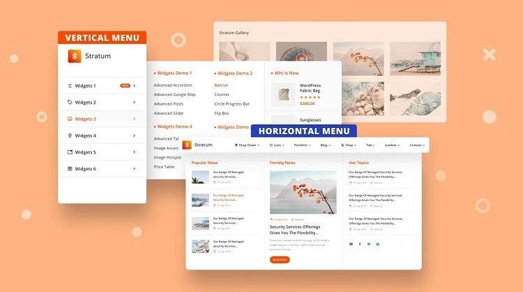
🧩 Types of Menus in WordPress
Not all menus are created equal. WordPress allows you to create multiple menus for different parts of your website. Each serves a unique purpose and enhances the user experience when used strategically.
🔝 1. Primary (Main) Menu
This is the menu you’ll find at the top of most websites — typically placed in the site’s header. It’s the main navigation hub, often showing links to your most important pages like:
- 🏠 Home
- 📖 About
- 📝 Blog
- 📞 Contact
This is the first place users look for direction — and search engines, too.
📍 2. Secondary Menu
Some themes support a secondary or “top bar” menu that appears above or below the main menu. These are perfect for:
- 🔒 Login/Register
- 🌐 Language Switchers
- 📍 Location or Contact Info
🦶 3. Footer Menu
Located at the bottom of the page, footer menus are ideal for:
- ⚖️ Privacy Policy & Terms of Service
- 📬 Contact or Support Links
- 🔗 Secondary navigation (FAQs, Site Map, etc.)
These menus are less prominent but crucial for trust and usability — especially on larger sites.
📚 4. Sidebar (Widget) Menus
Sidebar menus often appear in blog layouts, archives, or shop pages. You can use these to:
- 🗂 Navigate categories or tags
- 🛒 Filter products (in WooCommerce)
- 📚 Browse archives or recent posts
📱 5. Mobile (Responsive) Menus
When your site is viewed on a smartphone or tablet, the menu usually turns into a “hamburger icon” (☰) that expands into a vertical list. This responsive design ensures your navigation works seamlessly across all devices.
WordPress lets you create one menu and assign it to multiple locations — or create separate menus tailored to each location.
Pro Tip: Keep menus clean and purposeful. Just because you can add 20 links doesn’t mean you should.
Next, we’ll walk through how to create your very first menu in WordPress, step by step.
🛠️ Creating Your First Menu: Step-by-Step Guide
Ready to build your very first WordPress menu? Whether you’re creating a sleek navigation bar or a basic list of pages, WordPress makes the process surprisingly easy — no coding required.
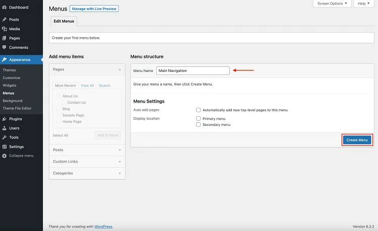
✅ Step 1: Open the Menus Page
In your WordPress dashboard, go to:
Appearance → MenusThis will take you to the main menu editor where you can create and manage all your site’s navigation menus.
✅ Step 2: Create a New Menu
Click on “Create a new menu”, give it a name (like “Main Menu”), and click Create Menu.
Tip: Menu names are for your reference only — they won’t appear publicly.
✅ Step 3: Add Menu Items
On the left-hand side, you’ll see boxes labeled:
- 📄 Pages
- 📝 Posts
- 📂 Categories
- 🔗 Custom Links
Check the items you want to add and click “Add to Menu”.
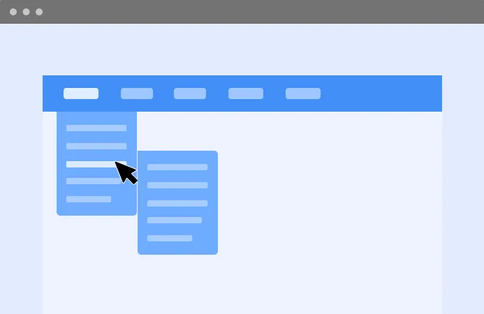
✅ Step 4: Rearrange or Nest Items
Use drag-and-drop to reorder your links. Want to create a dropdown? Drag one item slightly to the right under another — this creates a submenu.
Example:
🏠 Home
📖 About
👉 Our Team (submenu)
👉 Careers (submenu)
✅ Step 5: Choose a Display Location
Scroll down to the “Menu Settings” and select the location where you want your menu to appear. These options depend on your theme and might include:
- 🔝 Primary Menu
- 📍 Top Menu
- 🦶 Footer Menu
- 📱 Mobile Menu
Hit “Save Menu” and you’re done!
And that’s it! You now have a fully functioning, customized menu on your WordPress site.
✨ Pro Tip: Start with just a few core pages. A clean, simple menu is more effective than a cluttered one.
Next up: Let’s learn how to edit, update, and fine-tune your menus after they’re live.
✏️ Managing and Editing Menus
Once your menu is up and running, you’ll likely need to tweak it over time. Add new pages, remove outdated links, rearrange items — WordPress makes all of this intuitive.
🔄 Accessing an Existing Menu
Head to:
Appearance → MenusFrom the dropdown at the top, select the menu you want to edit and click “Select.”
➕ Adding New Items
To add a new page, post, or category:
- Locate it in the left sidebar
- Check the box
- Click “Add to Menu”
Then drag it to the right position in the list — easy!
🗑️ Removing Menu Items
Click the dropdown arrow on a menu item to expand its options, then hit “Remove.”
Clean out old or broken links to keep your menu fresh.
✍️ Customizing Menu Labels
Want to change how an item is labeled in the menu?
Click to expand the menu item and edit the Navigation Label — this doesn’t affect the page title, just how it displays in the menu.
Example: You can shorten “About Our Organization” to just “About” for cleaner menus.
📁 Nesting Items for Dropdowns
To create a submenu (dropdown), drag an item slightly to the right beneath another menu item. This will nest it as a child of that parent item.
Dropdowns are a great way to organize content-heavy sites.
💾 Don’t Forget to Save!
Always click “Save Menu” after making changes — otherwise, your edits won’t show on the site.
✅ Quick Check: Make sure your menu location is still selected — themes can reset this when switching or updating.
Now that you’re confident editing menus, let’s explore how to bring them to life with style — using widgets and customization options.
🧱 Using Widgets and the Customizer to Display Menus
Creating a menu is only half the story. To make it visible on your site — especially in areas like sidebars or footers — you’ll often use Widgets or the WordPress Customizer.
🧩 1. Adding Menus with Widgets
WordPress widgets are small content blocks you can place in widget-ready areas (like sidebars, footers, or headers).
To display a menu in a widget area:
- Go to
Appearance → WidgetsorAppearance → Customize → Widgets - Find the widget area you want to use (e.g., “Footer Column 1” or “Sidebar”)
- Add a “Navigation Menu” widget
- Select the menu you want from the dropdown
- Give it a title (optional), and click Save
Example: A footer menu with links to Terms, Privacy Policy, and Support.
🎨 2. Managing Menus in the WordPress Customizer
The Customizer gives you a live preview of how your menu will look in real time — no refreshing required.
To manage menus via the Customizer:
- Go to
Appearance → Customize - Click on Menus
- Create or edit menus and assign them to theme locations (e.g., Primary, Footer, Mobile)
- Preview changes immediately
- Click Publish to apply changes
💡 Widget vs Customizer: What’s the Difference?
- Widgets – Best for adding menus to sidebars and footers
- Customizer – Best for setting main navigation and seeing instant changes
Both methods are beginner-friendly and don’t require any code — just point, click, drag, and drop.
✨ Pro Tip: Use the Customizer to test changes on your site without affecting what visitors see until you’re ready.
Next, we’ll look at how menus behave on mobile and how to ensure your site is fully responsive.
📱 Mobile Menus and Responsive Design
In today’s mobile-first world, your WordPress menus need to work flawlessly on smartphones and tablets. Thankfully, most modern themes are built to be responsive, meaning menus automatically adjust to fit smaller screens.
🍔 What is a Mobile Menu?
On mobile devices, full-width navigation bars are replaced with a compact “hamburger” icon (☰). Tapping it reveals a vertically stacked menu — often sliding in from the side or top.
🔍 How to Check Your Site’s Mobile Menu
- Go to
Appearance → Customize - Click the responsive preview icons (tablet and mobile)
- Navigate to your menu to see how it behaves on smaller screens
You can test layout, colors, dropdown behavior, and icon placement — all in real-time.
Tip: If your menu doesn’t appear or work well on mobile, consider switching to a more modern, responsive theme.
🛠️ Customizing the Mobile Menu
Many themes offer mobile-specific menu settings in the Customizer or theme options panel. You may be able to:
- 🖼 Change the hamburger icon style
- 🎨 Adjust font sizes and spacing
- 📏 Limit how many menu items appear
- 🧭 Control menu animations (slide vs fade)
If your theme doesn’t support much customization, you can use plugins like:
- WP Mobile Menu
- Responsive Menu
- Max Mega Menu (for advanced controls)
📊 Why Mobile Menus Matter
- 📉 Over 50% of web traffic comes from mobile devices
- 📈 Google uses mobile-first indexing (your mobile site impacts your SEO)
- 📱 Bad mobile navigation = high bounce rate and poor user experience
✅ Pro Tip: Keep your mobile menus concise — 5 to 7 core links is ideal. Too many options can overwhelm users on small screens.
Up next, let’s explore how to use plugins to take your WordPress menus to the next level with mega menus, icons, and more.
🚀 Enhancing Menus with Plugins and Advanced Features
Basic WordPress menus work well out of the box — but what if you want dropdown mega menus, icons, images, or even conditional visibility based on user roles?
That’s where plugins come in. With the right tools, you can transform your navigation into a highly interactive and user-friendly experience.
🔌 Popular WordPress Menu Plugins
- Max Mega Menu
Adds a drag-and-drop mega menu builder with widget support, animation effects, and advanced styling. - WP Mega Menu
Great for building multi-column layouts with icons, images, and tabs inside your menus. - Responsive Menu
Perfect for mobile customization — control slide-outs, colors, and animations with ease. - Conditional Menus
Show different menus based on user role, page type, or device.
🎨 Adding Icons and Images to Menu Items
Many plugins — or theme builders like Elementor or Astra — allow you to add icons, badges, or thumbnails next to your menu links. This adds visual context and can help improve click-through rates.
Example: 🛒 “Shop” icon for your Store link or 📞 “Call Us” next to Contact.
Some themes even include this natively under:
Appearance → Menus → CSS Classes(You may need to enable “CSS Classes” under “Screen Options” at the top of the Menus page.)
⛔ Control Menu Visibility with Conditions
Want to hide certain menu links from logged-out users or show admin-only pages?
- Use the Conditional Menus plugin
- Or use page builders like Elementor Pro that offer menu visibility rules
⚙️ Menu Enhancements with Theme Builders
If you’re using a theme builder like:
- Elementor
- Divi
- Beaver Builder
You can fully design your menus with custom headers, animations, and responsive breakpoints. These builders often replace the default WordPress menu system entirely.
💡 Pro Tip: Only install one major menu plugin at a time. Multiple menu systems can conflict and cause layout issues.
You’re now ready to create dynamic, engaging, and fully customized menus that go far beyond the basics. But before we wrap up, let’s summarize everything you’ve learned.
✅ Final Thoughts: Mastering Menus in WordPress
Menus are the backbone of your website’s navigation — and when done right, they quietly guide your visitors to the content they care about most. Whether you’re building a simple blog or a complex e-commerce site, WordPress gives you the flexibility to create intuitive, powerful, and stylish menus with just a few clicks.
🔁 Let’s Recap What You’ve Learned
- ✅ What WordPress menus are and why they matter
- 🛠️ How to create, edit, and manage menus using the native interface
- 🧩 How to display menus using widgets and the Customizer
- 📱 How to optimize your menus for mobile devices
- 🚀 How to extend menu functionality with plugins and advanced tools
No coding required. Just smart layout, clean labels, and thoughtful user experience.
💡 Final Tips
- Keep it clear and concise — too many links can overwhelm users
- Group related items together — use dropdowns when necessary
- Test your menus across desktop, tablet, and mobile
- Don’t forget accessibility — make sure your menus are keyboard- and screen reader-friendly
📚 Keep Exploring
If you’re ready to take your menus to the next level, here are some excellent next steps:
- 🧱 Learn more about header design and site structure
- 🎨 Experiment with Elementor or Full Site Editing (FSE)
- 🔐 Try role-based menu access for membership or course websites
🙌 Remember: Navigation is your user’s compass. Build menus that help them find their way — and they’ll stick around longer.
Thanks for following along! If this guide helped you, consider sharing it with others who are building their WordPress sites. Happy editing ✨